|
|
Post by toei on Feb 25, 2020 3:42:22 GMT -5
What are some of the ugliest games you know? I'm curious because as retro gamers, we're not the type to just dismiss everything old as ugly; some of us even like early 3DO/PSX/Saturn-era 3D, which tends to elicit a lot less nostalgia than, say, 16-bit 2D. This is meant to be a lighthearted thread, let's not worry about our picks too much.
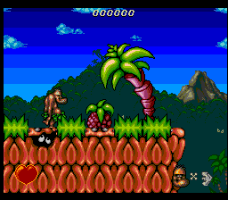
As for me, I recently tried Donkey Kong Land for the first time, and wow, porting those 3D-rendered sprites to the GB was not a good move.
I always thought Road Rash 3 looked bad, too, even though I really like the game. In general digitized graphics are looked down upon, and while I do think regular sprites look better 100% of the time, something about RR3 is just worse. Could be the incredibly grainy backgrounds and the way the sprites clash with the roads, and with each other (and why are the helicopters barely bigger than one guy on a bike?), or maybe it's just that the first two games looked so much better.
|
|
|
|
Post by Sarge on Feb 25, 2020 11:59:24 GMT -5
Can I be weird and say I kinda like Donkey Kong Land's graphics? They can get very muddled, but something in me likes that they went for it, even just in four colors. I do tend to agree on Road Rash 3, the visuals there really clash. The game looks... cheap? It almost reminds me of some terrible Flash games. When I think of ugly games, though, I usually think of games that just have awful artistic design. Something like this:  Of course, it doesn't help that the game itself is objectively awful as well. |
|
|
|
Post by toei on Feb 25, 2020 12:11:43 GMT -5
Ironically, I kind of like the graphics in the game you picked as ugly, too. It has a post-apocalyptic feel to me, whether that's intended or not (what game is that?) I'm just not sure why that one building has a random blue portion.
|
|
|
|
Post by Sarge on Feb 25, 2020 12:25:32 GMT -5
Yeah, that's supposed to be a ruined city, so it succeeds on that front. The game is X-Men on NES, and that's supposed to be Wolverine.
|
|
|
|
Post by Ex on Feb 25, 2020 13:23:39 GMT -5
I really hate the way a lot of 16 and 32-bit 2D platformers from Europe look. Just garish as hell. When I have more time, I'll cite some screenshots examples.
Also the reason I've never finished Ultima 6 or 7 is because of the extremely unpleasant isometric view those games use. It just hurts my brain to look at.
|
|
|
|
Post by Sarge on Feb 25, 2020 13:35:48 GMT -5
I very much agree with the perspective stuff in Ultima VI/VII. It always feels super wonky to me.
|
|
|
|
Post by toei on Feb 25, 2020 14:41:30 GMT -5
Yeah, that's supposed to be a ruined city, so it succeeds on that front. The game is X-Men on NES, and that's supposed to be Wolverine.Haha, well I'll grant you that it definitely fails at that. I really thought it was a giant mecha. Ex Oh yeah, the super leaned-back Ultima VII view. I don't hate it, but it does look weird. I'm not sure why they couldn't go for a more normal isometric perspective. And I'm with you on ugly European games, though I'm still looking forward to screenshots. |
|
|
|
Post by Ex on Feb 25, 2020 15:38:03 GMT -5
though I'm still looking forward to screenshots. You may have to zoom your screen in to see the details, these pics are small. These are a few examples of the European platformer styles which I think look like trash: 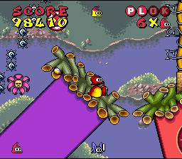 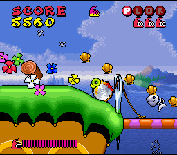 Plok
Chuck Rock
Jim Power
Gods
Dizzy the Adventurer
To really get into the gross stuff, I'd have to trawl platformers on computers that were popular in Europe during the '80s and '90s. But I'm not going to subject myself to that torture. Trust me, if the stuff above looks bad, the stuff you've never seen on the Euro PC front is far, far worse.
About the only European developer that created GOOD looking platformers was Psygnosis. Flink and The Adventurers of Lomax have really detailed somber graphics.
|
|
|
|
Post by Sarge on Feb 25, 2020 15:48:33 GMT -5
Jim Power is way too busy, but I think Plok looks quite good. Colorful makes sense there. EDIT: I've always thought Treasure Master just looked... off. 
|
|
|
|
Post by Ex on Feb 25, 2020 15:55:34 GMT -5
It's not that Plok's graphics are colorful. It's that Plok's graphics have no continuity to their design at all. It's like three different artists made the terrain, backgrounds, and sprites. The banded shading on the terrain, dithered sprites, and pastel backgrounds just don't mix right. The giant font on the screen looks ridiculous. I hate it!
|
|